The Rested
Art Direction, Brand Strategy, Identity and Packaging
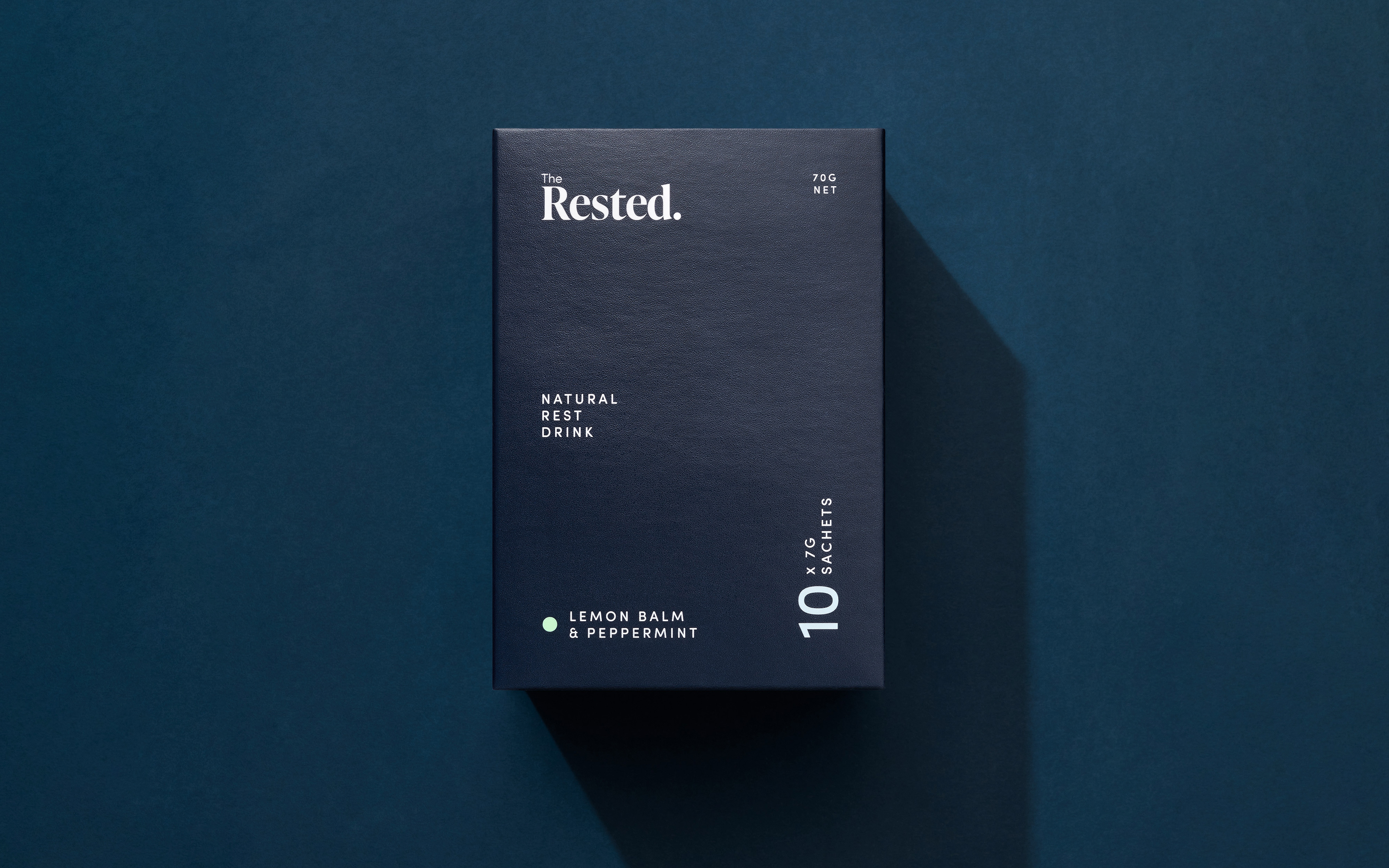
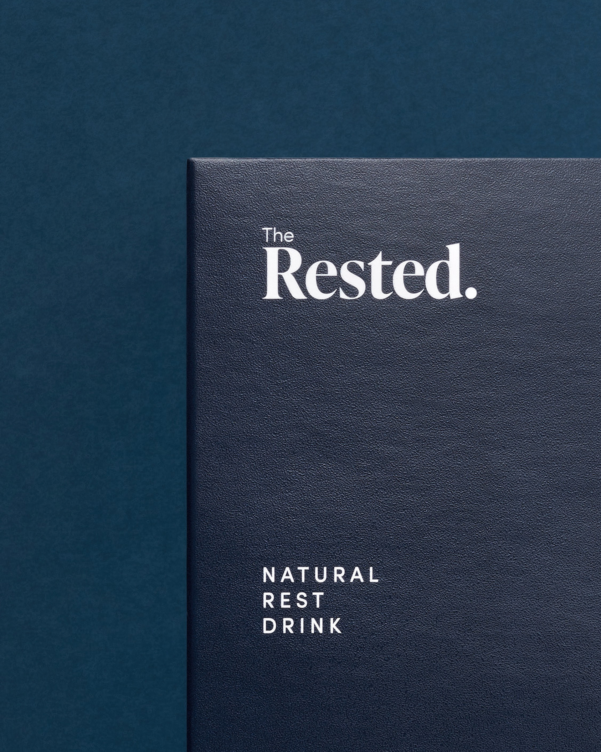
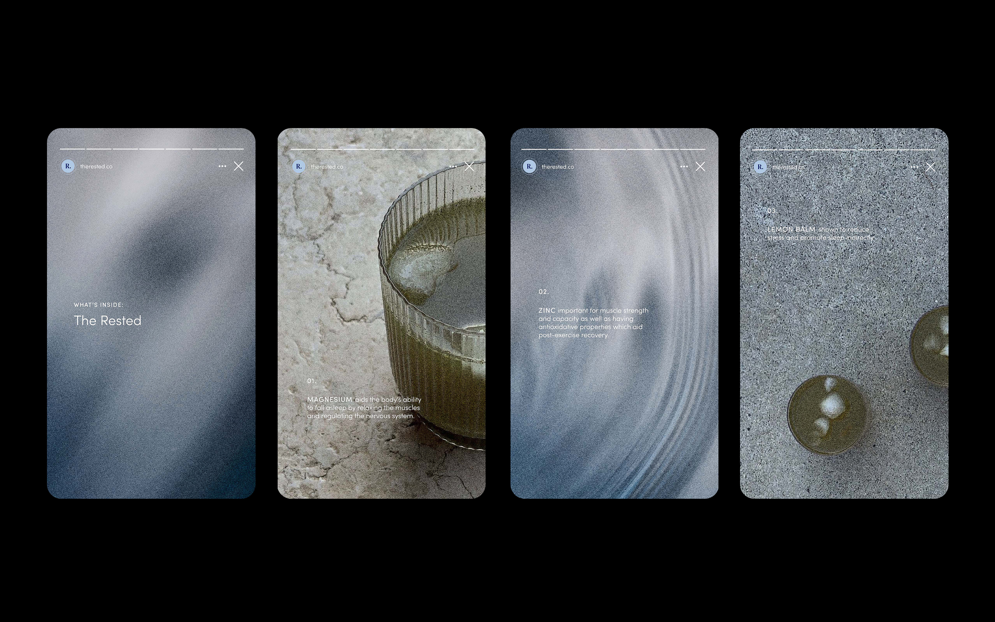
The Rested is a magnesium-based sleep supplement designed for busy individuals seeking optimal rest to maximise their day.
I worked closely with founder Josh to craft a brand strategy which struck a balance between the relaxation of deep sleep and the energised feeling of waking up Rested.
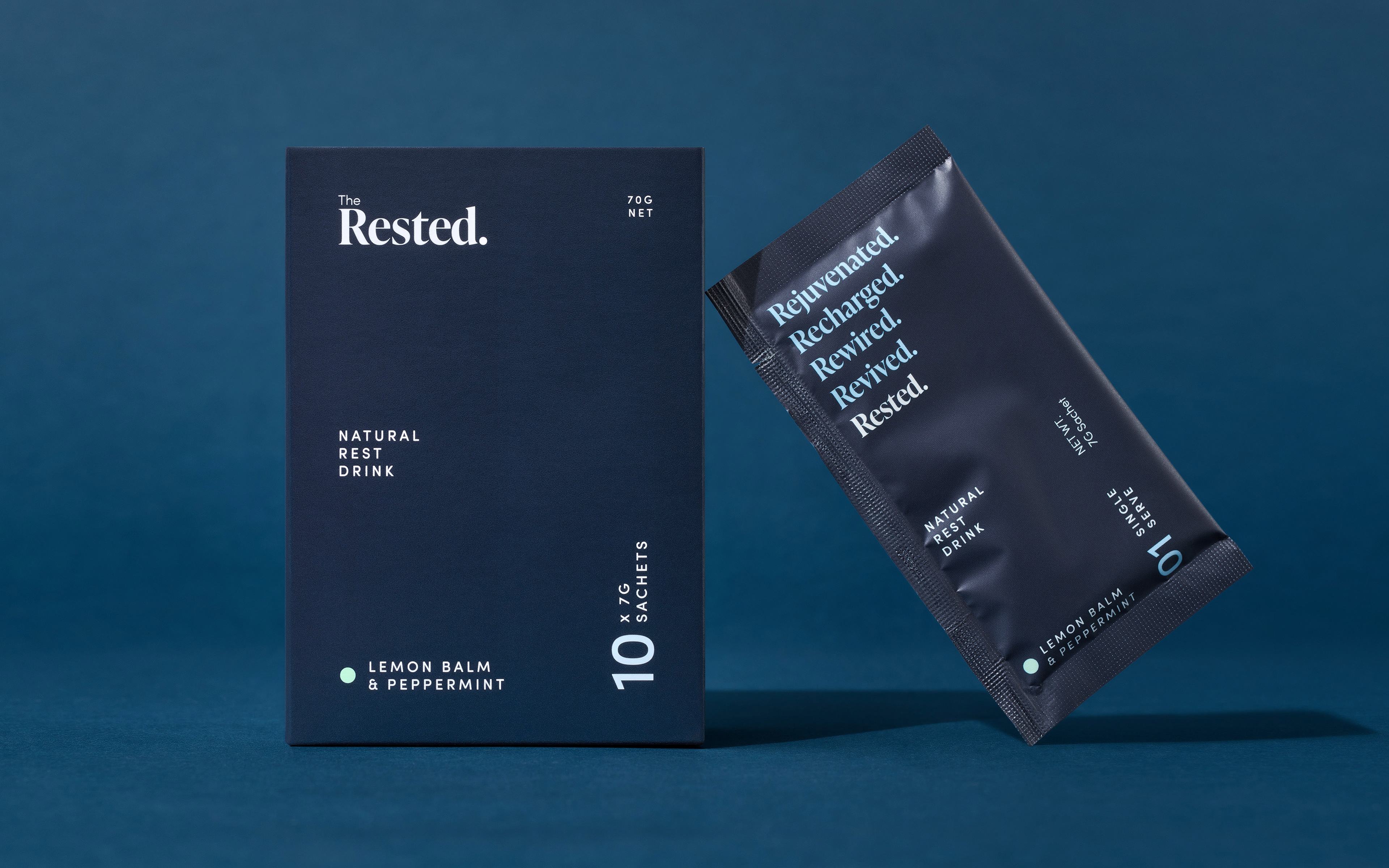
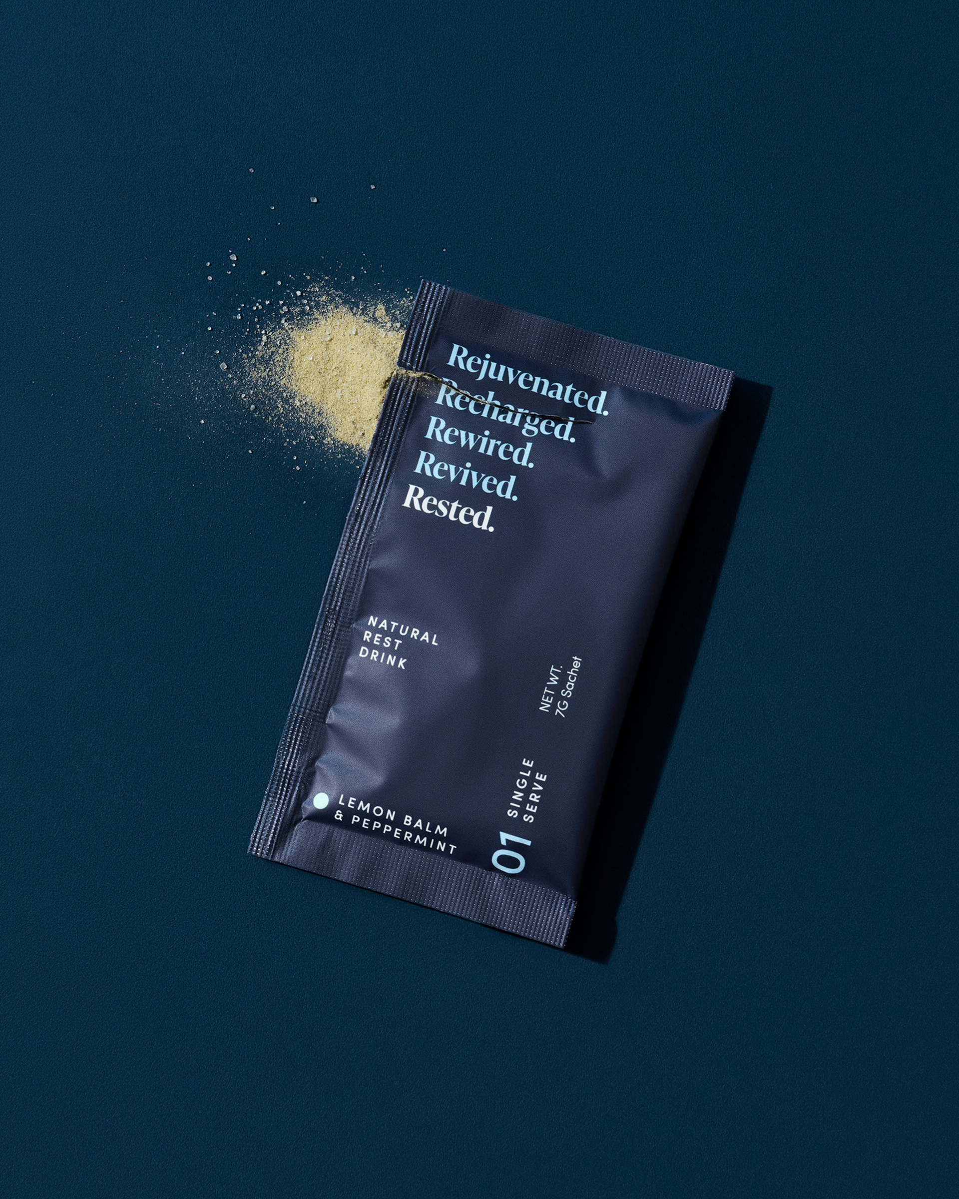
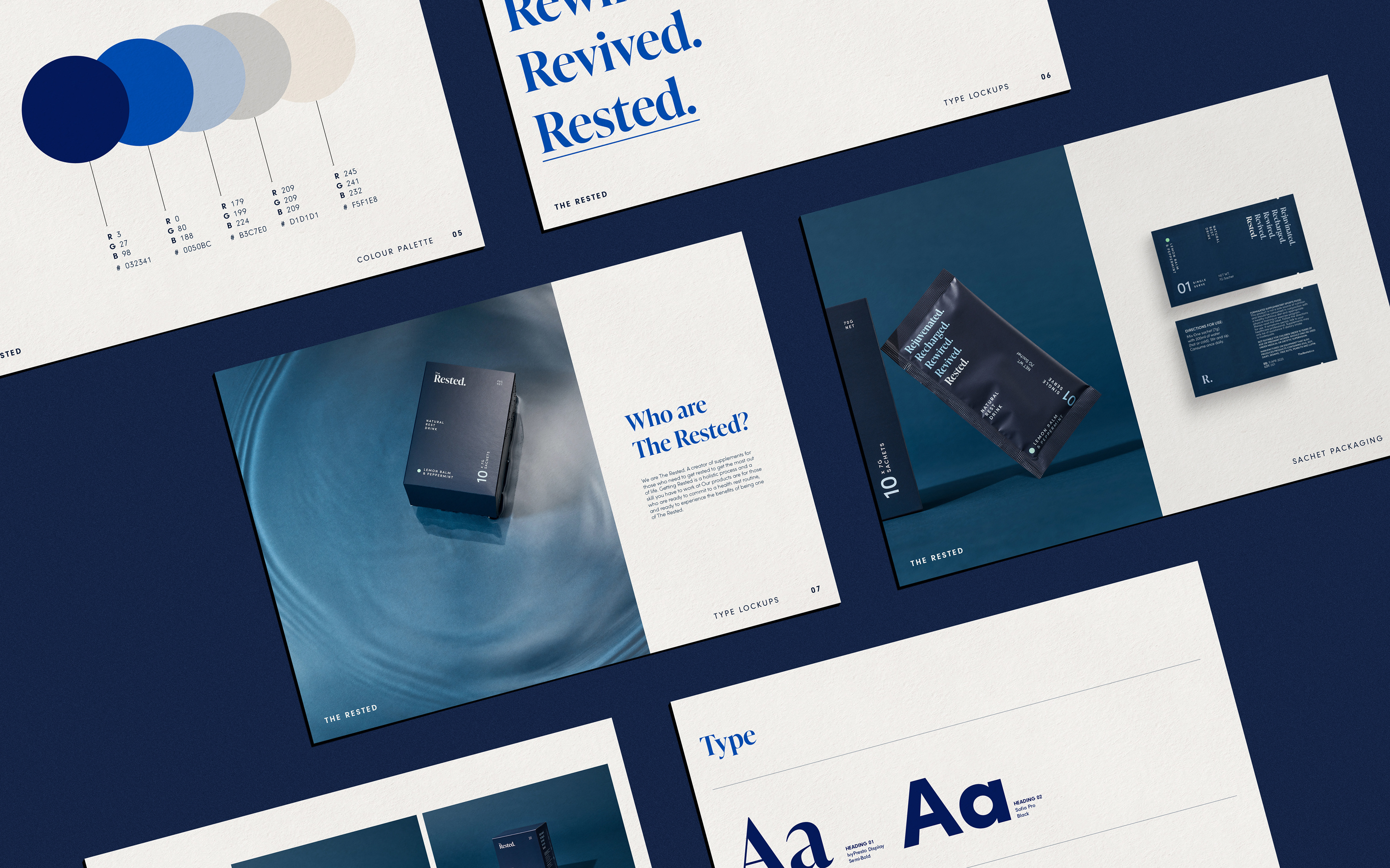
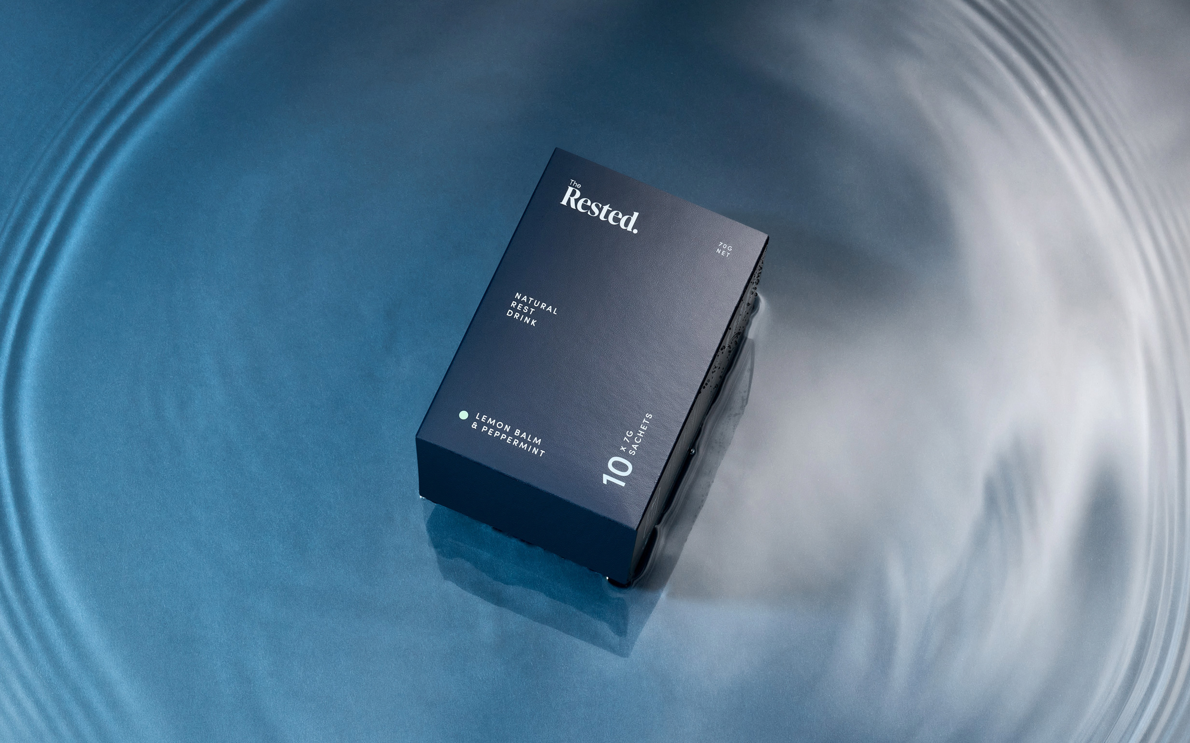
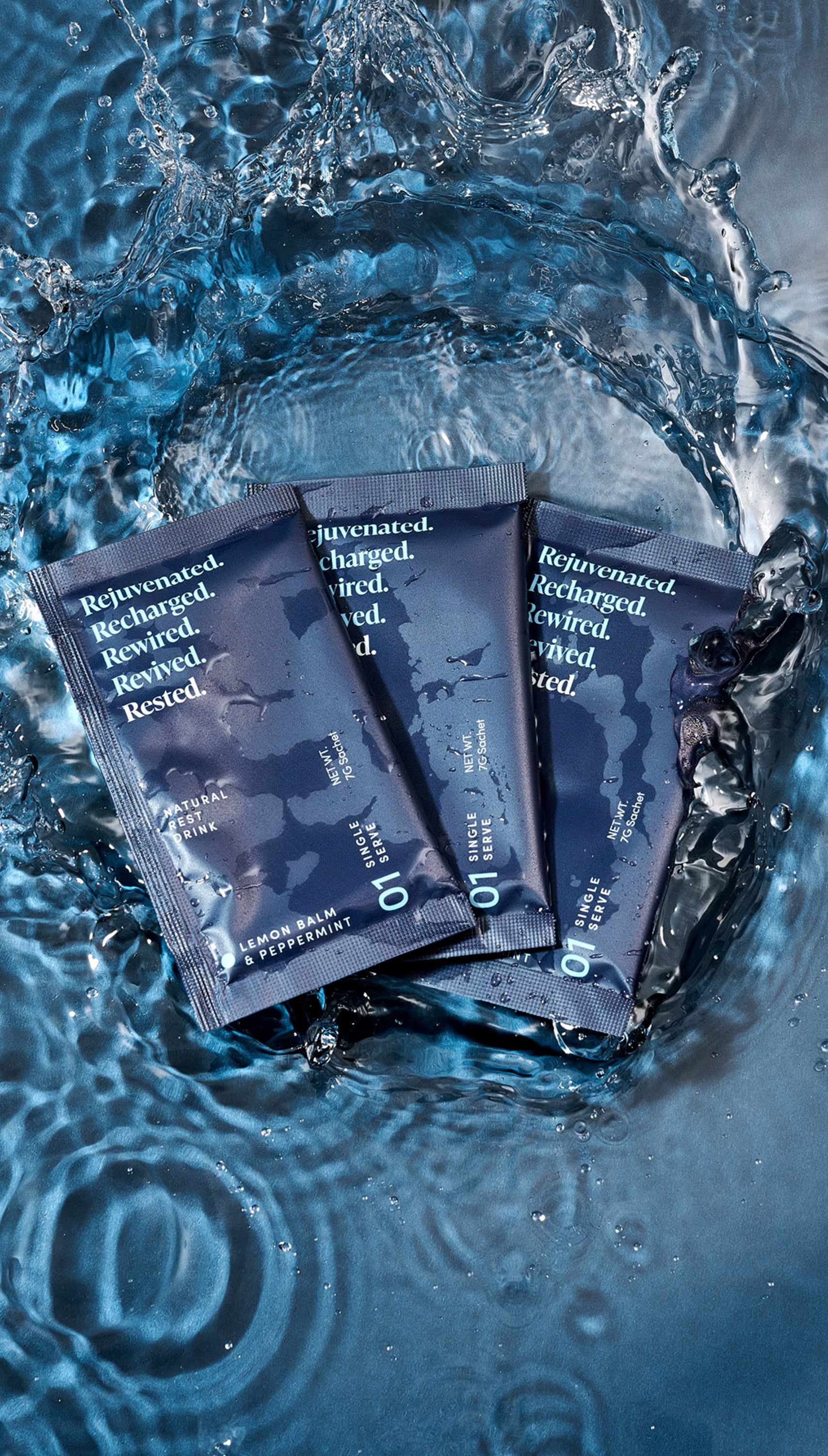
A serene primary blue anchored the visual identity, evoking calm and restfulness. Campaign photography depicted the product both floating on water, and creating energetic ripples to suggest drifting into sleep and emerging refreshed.
The copy and typography were carefully curated to play on the brand name Rested, extending into a series of uplifting “Re” words: Rejuvenated, Revived, Revitalised, Rewired — each reinforcing the transformative power of true rest.
Freelance Project
Client The Rested
Photography Daniel Herrmann-zoll
Client The Rested
Photography Daniel Herrmann-zoll